Graphical Projection and Analysis of Production Using Calc
Many times we must have felt the need of knowing at a glance how many machines can be produced from our inventory stock. Well here is a simple step by step method to do it in Calc, a free
open source component of Open Office. This a brief tutorial for analysing and making projections of production considering the current stock of raw materials in stock using charts in Open Office Calc.
As a first step we have to create the spreadsheet in calc and enter the various details
| Dispatched Items | Part No. | Description | Q/U | Cst/U | Current Stock | Description | No. Of M/c | By Initial Stock | 12/01/09 |
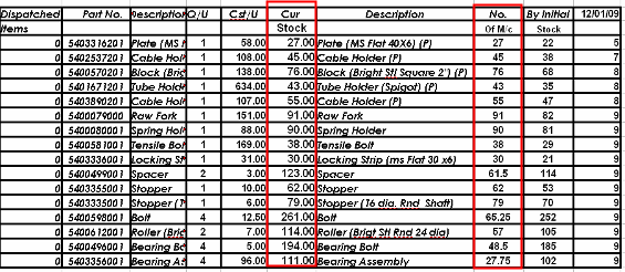
The dispatched items column represents the manufactured units that have been dispatched from the production site. Part No is the poduct code of the individual part used and Q/U is the quantity in numbers of that
part that is required for manufacturing the machine as a whole.
Cst/U is the cost per unit of the individual part. Current Stock is the
current stock level of the part. No. Of M/c is the Number of complete Machines that can be
manufactured with the quantity of stock.
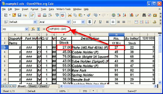
To keep things simple we will keep entering the stock as it comes in each month. We have entered the stock of Jan under 12/01/09. The total stock will now be a sum
of the initial stock and the incoming stock. The first two rows are reserved for headings and the third row onwards will contain our data. Therefore in F3 which is our first data cell under current stock we have to enter the formula =SUM(I3:Y3) . Then
fill the rest of the cells under F3 by highlighting F3 dragging the mouse till the last cell under the column while keeping the ctrl key pressed all the time.
We then proceed towards calculating the Number of complete Machines that can be
manufactured with the quantity of stock. In H3 which is our first data cell under No. Of M/c we have to enter the formula =(F3/D3) - (A3) . Then
fill the rest of the cells as earlier. Here A3 is the number of machines dispatched in that particular year.
Graphical Projection of Production - Creating the Chart
The first step is selecting the two data columns namely the description and the No. Of M/c columns.
Note that we have to select the third row onwards of these columns as the first two are header rows. Then we have to click on the chart icon on the Calc toolbar.
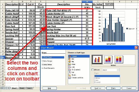
Next we have to select the data range for the calc chart. In this case we have to select Data Series in Rows.
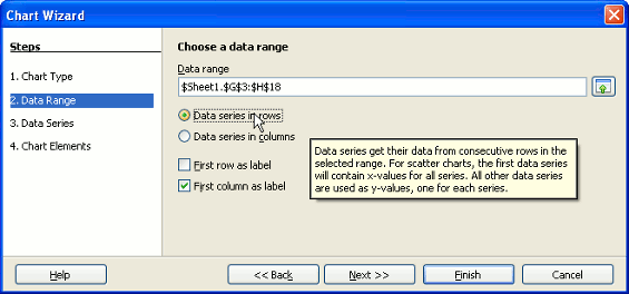
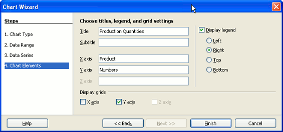
When Step 3 data series appears just click on next. Finally under Step 4 under Chart elements specify the title of the chart, X-axis title and Y-axis Title.
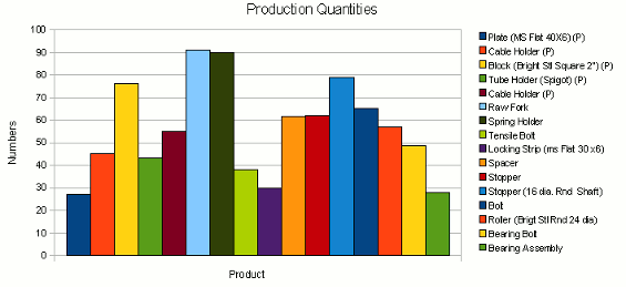
Completed Chart for Production Analysis
The completed chart can now be placed below our data rows.We can also resize it
until the size is to our satisfaction.The font sizes and fonts of the various labels can also be changed if necessary. Below is a screenshot of the completed chart.